


 Candice Tillman
You’ve just received the green light for a real-time analytics dashboard as a frontend developer. It needs to manage 50,000 data points without slowing down, support mobile gestures, and launch in six weeks.
The wrong library choice can quickly backfire. Some perform well in demos but fail under real loads or demand lots of custom CSS, forcing rebuilds, slipped timelines, and lost stakeholder trust.
Most lists dump dozens of libraries on you. We narrowed it to the seven that actually ship in production and ranked them on maturity, load performance, framework compatibility, chart flexibility, and developer experience.
Some libraries excel at GPU-accelerated rendering, while others are designed specifically for modern frameworks and development workflows. A few include 60+ charts ready to use, while one offers full DOM control with a steeper curve.
Below, we’ll cover how to choose based on your constraints, then review each of the top seven with practical verdicts on strengths, weaknesses, and ideal scenarios.
How to Choose a JavaScript Chart Library
Before testing any library, match it against these five key criteria.
- Performance ceiling. If you’re working with 10,000+ data points or frequent updates, go for Canvas or GPU-accelerated options. SVG works fine for smaller sets.
- Framework alignment. React teams usually prefer native component wrappers. Angular and Vue do well with official support, while vanilla JS shines with lightweight, dependency-free libraries.
- Chart type breadth. Simple dashboards might need just 10-15 types. Larger enterprise apps often want 50+, including maps, Gantt charts, and candlesticks. Pick one that covers what you actually need.
- Customization depth. Some libraries give you polished themes with limited tweaks. Others offer full control at the expense of more code. Decide how much visual flexibility you really require.
- Licensing and support. Open-source keeps costs low but means your team handles upkeep. Commercial options bring official support and steady updates—often essential for regulated or long-term projects.
Top 7 JavaScript chart libraries
The following rankings are based on how well these libraries work in real-world projects. We looked extensively at how they perform under stress, how effectively they integrate with major frontend frameworks, and how quickly developers can complete tasks.
Each section includes practical details like the main technical trade-offs and the situations where a particular library really stands out.
SciChart
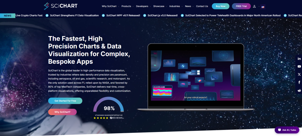
SciChart first appeared in 2012, and it has earned its reputation as the best JavaScript chart library for serious high-performance work. While most charting tools struggle once you push past a certain data size, SciChart was built to handle millions of points without breaking a sweat.
The secret is its GPU-accelerated rendering, which keeps the CPU free and enables true real-time big data visualization that others can’t match. That’s why teams in aerospace, oil & gas, research labs, and motorsport rely on it for critical applications — sensor feeds, telemetry streams, and fast-moving financial data all need those sub-millisecond updates and perfect precision.
What sets it apart even more is the proprietary performance design. It outperforms others on data density, making it ideal for visualizing oscilloscope traces, seismic information, or live trading setups. When every frame counts, SciChart delivers reliably. And best of all, it keeps scaling as your projects get bigger.
| Attribute | Value |
| Founded | 2012 |
| Best For | Real-time big data, scientific/industrial dashboards |
| Performance Focus | GPU-accelerated rendering for millions of data points |
| Notable Feature | Sub-millisecond refresh rates on high-density datasets |
Key Features
SciChart really shines when you’re dealing with massive datasets. It can handle 10 million data points updating in real time without breaking a sweat—something that brings most other JavaScript charting libraries to their knees.
Its GPU-powered rendering is a big reason why. By shifting the heavy work to dedicated hardware, it keeps your CPU free for everything else your app needs to do.
That’s why you’ll find it powering demanding setups like motorsport telemetry and seismic monitoring. If your project needs high speed and precision under constant heavy loads, SciChart’s performance focus often makes the difference.
amCharts
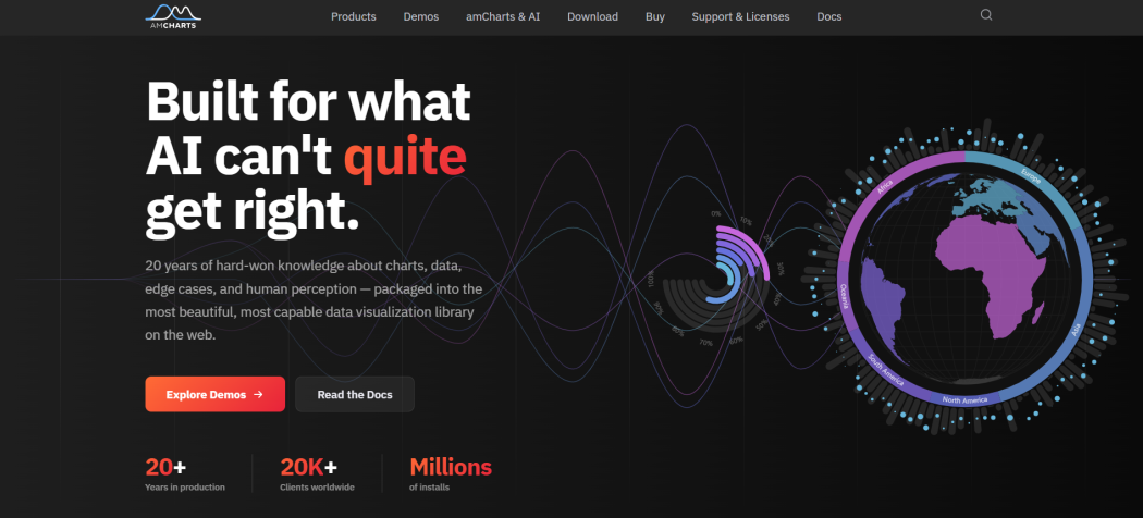
Since launching back in 2006, amCharts has built up almost two decades of charting know-how. It shows.
You get support for 60+ chart types—everything from interactive maps and financial charts to Gantt timelines. Whether you’re putting together straightforward dashboards or digging into detailed data stories, it covers the bases.
On top of that, its canvas rendering shines with big datasets. It often outperforms SVG competitors when you need things to stay fast and responsive.
With over 20,000 companies using it globally, it’s a proven solution. If your team wants plenty of flexibility without slowing down, amCharts delivers.
| Attribute | Value |
| Founded | 2006 |
| Chart Types | 60+, including maps, financials, Gantt |
| Rendering | Canvas (performance-optimized) |
| Best For | Enterprise dashboards with diverse visualization needs |
Key Features
What sets amCharts apart is its wide variety of visualization options. In addition to regular charts, you have interactive maps, stock charts, Gantt timelines, and dashboard elements all in one place.
It comes with built-in interactivity, strong financial charting capabilities, accessibility support, responsive design, easy export tools, and deep customization options.
Teams often find it works well for both straightforward business dashboards and more complex enterprise setups.
ApexCharts.js
ApexCharts.js first appeared in 2018, after React, Vue, and Angular had already taken over the frontend world—and it shows. The library ships with over 20 chart types plus native support for React, Angular, Vue, and Blazor. That alone saves you from the adapter problems that plague many older tools.
Zooming, panning, and annotations are included by default, so you’re not constantly hunting for plugins. The whole thing just works. Documentation is thorough and practical, and the API is kept lean instead of overwhelming you with giant configuration objects.
If your team is working on modern SPAs and wants reliable interactive charts without reinventing everything, ApexCharts.js offers a smart mix of capability and simplicity that many alternatives miss.
| Attribute | Value |
| Founded | 2018 |
| Best For | Modern framework SPAs |
| Chart Types | 20+ with interactions |
| Framework Support | React, Angular, Vue, Blazor |
Key Features
One of the best parts of ApexCharts.js is its built-in responsive design—charts adjust perfectly on mobile without custom work.
The annotation system makes it easy to add markers, text, or shapes right on the data. Smooth animations, flicker-free real-time updates, and simple CSS theming round it out nicely.
Highcharts
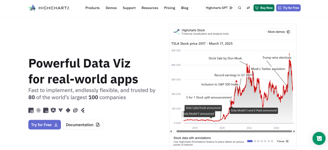
Highcharts offers a full set of tools — Core, Stock, Maps, Gantt, Grid, and Dashboards — all in one ecosystem. You can go from basic charts to complex financial visuals and geographic maps without switching libraries.
It works naturally with modern frameworks like React, making it easier for teams to create dashboard interfaces. Plus, Highcharts pays real attention to accessibility and provides strong support, which sets it apart from competitors that often treat these as extras.
You get cross-platform consistency too. Write once, and it runs well on both web and mobile. From live stock tickers and sales territory maps to project Gantt charts, all the pieces use the same license and API approach.
| Attribute | Value |
| Product Line | Core, Stock, Maps, Gantt, Grid, Dashboards |
| Best For | Teams needing multiple chart types in one ecosystem |
| Framework Support | React, Angular, Vue |
| Accessibility | Built-in screen-reader support |
Key Features
The multi-product architecture is a real plus. You won’t have to stitch together different libraries every time your project grows.
Stock charts support candlestick and OHLC data right out of the box. Maps handle GeoJSON and TopoJSON without any extra dependencies. Gantt timelines come with built-in drag-and-drop editing for tasks.
A unified theming system keeps your brand colors consistent across every chart type. And the responsive design automatically adjusts layouts for mobile screens, so everything stays usable without extra work.
D3 by Observable
D3 launched back in 2011, and it’s still one of the most respected visualization libraries in JavaScript.
Rather than giving you finished charts, it provides the core building blocks. You bind data to DOM elements and create exactly what you need with SVG, Canvas, scales, and transitions.
There’s a real learning curve, no question. But that flexibility is exactly why it remains a go-to for custom dashboards, scientific visuals, and editorial work. Its modular design keeps bundles small, so newsrooms, researchers, and enterprise teams continue choosing D3 when they want complete control.
| Attribute | Value |
| Founded | 2011 |
| Best For | Custom visualizations requiring full DOM control |
| Chart Types | Unlimited—build any visual from primitives |
| Framework Support | Framework-agnostic; integrates via standard DOM APIs |
Key Features
D3 stands out for its modular approach. You import exactly what you need for each project, which helps maintain small bundle sizes.
The library offers selection APIs for DOM work, scale functions, axis tools, animation engines, and geographic projections. It fits well into React, Vue, or plain JavaScript setups. By working directly with the DOM as the source of truth, it keeps rendering predictable while leaving state management in your hands.
Recharts
Recharts launched in 2015 as an open-source library built specifically for React teams. It finally got what modern frontend developers actually need. No messy configuration objects. No jQuery. Just clean, declarative JSX components that fit right into your existing React code, just like any other UI element.
Every part of the chart — axes, tooltips, legends, series — is a proper React component. You compose, style, and animate them using the same patterns you already know. It uses SVG under the hood with only light D3 dependencies, so you get smooth performance without pulling in the full D3 library.
It covers the essentials: Line, Bar, Area, Pie, Scatter, Radar, Funnel, and Composed charts. That’s plenty for most dashboards without making your bundle size balloon.
| Attribute | Value |
| Founded | 2015 |
| Best For | React SPAs and component-driven dashboards |
| Rendering Engine | SVG with D3 utilities |
| Chart Types | 8 core types + composed charts |
Key Features
Recharts treats every visual element as a React component you import and nest. Want a tooltip? Drop in `<Tooltip />`. Need custom animations? Pass props like `animationDuration={800}`.
This compositional model means your charting code lives alongside your UI logic, shares the same state management, and hot-reloads during development. For teams already invested in React, the learning curve is nearly flat—if you understand props and children, you understand Recharts.
ZingChart
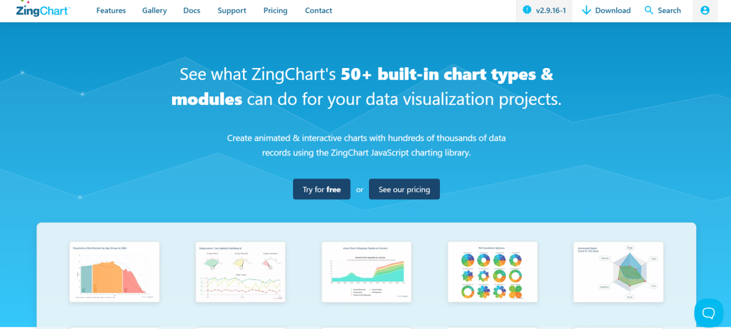
ZingChart started in 2009, so it carries more than 15 years of experience from real projects across global teams.
It addresses a pain point many developers face: picking a flashy library only to get stuck with it later. Being completely dependency-free, it integrates cleanly into any environment — vanilla JavaScript, older frameworks, or modern single-page apps. Setup stays simple.
You’ll appreciate the range it offers. With 50+ built-in chart types, it covers standard graphs as well as heatmaps, timelines, and stock visuals. The library is optimized for 10,000 to 100,000 data points and manages real-time updates nicely for live dashboards. It’s not designed to beat GPU engines on huge datasets, but it works very well for mid-scale applications.
| Attribute | Value |
| Founded | 2009 |
| Chart Types | 50+ built-in |
| Performance Sweet Spot | 10K–100K records |
| Integration Model | Dependency-free JavaScript |
Key Features
ZingChart makes real-time data binding straightforward. Your charts update on the fly without reloading the page — a must-have for live monitoring dashboards and IoT solutions.
You get plenty of control through the API. Adjust animations, tooltips, or legends in detail when needed, while the built-in defaults keep things simple for everyday use.
It also shines in older enterprise setups thanks to solid cross-browser support that reaches back to IE9. If you’re working with modern frameworks, there are adapters for React, Angular, and Vue. But you don’t have to use them. The core library works independently without any issues.
Conclusion
Match the library to your real data volume, framework, and design needs.
For real-time dashboards pushing over 100,000 data points, SciChart stands out as the strongest choice. It handles massive loads smoothly, where others start to lag. CanvasJS is a solid runner-up. Smaller datasets under 10,000 points? SVG libraries like Recharts or Highcharts usually do the job just fine.
React teams tend to click well with Recharts or ApexCharts. Vue and Angular projects often work better with Highcharts or ZingChart. Need full creative control and pixel-perfect designs? D3 gives you the building blocks. Want something that looks polished right away? amCharts and FusionCharts have you covered.
Pick the one that actually fits your project, and you’ll ship on time with fewer headaches.